" transform="translate(0 4)" width="190.5px"/><path d="M 0 29.091 L 0 0 L 12.017 0 C 14.195 0 16.075 0.426 17.656 1.278 C 19.247 2.121 20.474 3.3 21.335 4.815 C 22.197 6.321 22.628 8.073 22.628 10.071 C 22.628 12.079 22.188 13.835 21.307 15.341 C 20.436 16.837 19.19 17.997 17.571 18.821 C 15.952 19.645 14.029 20.057 11.804 20.057 L 4.389 20.057 L 4.389 14.517 L 10.497 14.517 C 11.558 14.517 12.443 14.332 13.153 13.963 C 13.873 13.594 14.418 13.078 14.787 12.415 C 15.156 11.742 15.341 10.961 15.341 10.071 C 15.341 9.171 15.156 8.395 14.787 7.741 C 14.418 7.079 13.873 6.567 13.153 6.207 C 12.434 5.848 11.548 5.668 10.497 5.668 L 7.031 5.668 L 7.031 29.091 Z" fill="rgb(255, 255, 255)" height="29.090895000000003px" id="b0UkdZuJQ" transform="translate(6 70.398)" width="22.6278px"/><path d="M 27.77 14.943 C 27.77 18.144 27.154 20.857 25.923 23.082 C 24.692 25.308 23.026 26.998 20.923 28.153 C 18.831 29.309 16.482 29.886 13.878 29.886 C 11.264 29.886 8.911 29.304 6.818 28.139 C 4.725 26.974 3.064 25.284 1.832 23.068 C 0.611 20.843 0 18.134 0 14.943 C 0 11.742 0.611 9.029 1.832 6.804 C 3.064 4.579 4.725 2.888 6.818 1.733 C 8.911 0.578 11.264 0 13.878 0 C 16.482 0 18.831 0.578 20.923 1.733 C 23.026 2.888 24.692 4.579 25.923 6.804 C 27.154 9.029 27.77 11.742 27.77 14.943 Z M 20.582 14.943 C 20.582 13.049 20.313 11.449 19.773 10.142 C 19.242 8.835 18.475 7.846 17.472 7.173 C 16.477 6.501 15.279 6.165 13.878 6.165 C 12.486 6.165 11.288 6.501 10.284 7.173 C 9.28 7.846 8.509 8.835 7.969 10.142 C 7.438 11.449 7.173 13.049 7.173 14.943 C 7.173 16.837 7.438 18.438 7.969 19.744 C 8.509 21.051 9.28 22.041 10.284 22.713 C 11.288 23.385 12.486 23.722 13.878 23.722 C 15.279 23.722 16.477 23.385 17.472 22.713 C 18.475 22.041 19.242 21.051 19.773 19.744 C 20.313 18.438 20.582 16.837 20.582 14.943 Z" fill="rgb(255, 255, 255)" height="29.8864px" id="mVnHWP_qu" transform="translate(30.781 70) rotate(-6 13.885 14.943)" width="27.7699px"/><path d="M 0 29.091 L 0 0 L 12.017 0 C 14.195 0 16.075 0.393 17.656 1.179 C 19.247 1.955 20.474 3.073 21.335 4.531 C 22.197 5.98 22.628 7.699 22.628 9.687 C 22.628 11.705 22.188 13.419 21.307 14.83 C 20.426 16.231 19.176 17.301 17.557 18.04 C 15.938 18.769 14.02 19.133 11.804 19.133 L 4.205 19.133 L 4.205 13.594 L 10.497 13.594 C 11.558 13.594 12.443 13.456 13.154 13.182 C 13.873 12.898 14.418 12.472 14.787 11.903 C 15.156 11.326 15.341 10.587 15.341 9.687 C 15.341 8.788 15.156 8.045 14.787 7.457 C 14.418 6.861 13.873 6.416 13.154 6.122 C 12.434 5.819 11.548 5.668 10.497 5.668 L 7.031 5.668 L 7.031 29.091 Z M 16.378 15.795 L 23.622 29.091 L 15.952 29.091 L 8.849 15.795 Z" fill="rgb(255, 255, 255)" height="29.09089503326416px" id="z79owOgna" transform="translate(60.656 67.398) rotate(-9 11.811 14.545)" width="23.622199702453614px"/><path d="M 0 5.71 L 0 0 L 24.588 0 L 24.588 5.71 L 15.767 5.71 L 15.767 29.091 L 8.835 29.091 L 8.835 5.71 Z" fill="rgb(255, 255, 255)" height="29.090895000000003px" id="a1sDeTxNh" transform="translate(84.189 61.398) rotate(-14 12.294 14.545)" width="24.588000000000008px"/><path d="M 0 29.091 L 0 0 L 19.858 0 L 19.858 5.71 L 7.031 5.71 L 7.031 11.676 L 18.594 11.676 L 18.594 17.401 L 7.031 17.401 L 7.031 29.091 Z" fill="rgb(255, 255, 255)" height="29.090895000000003px" id="J_nFqpfk2" transform="translate(112.211 52.398) rotate(-28 9.929 14.545)" width="19.85799999999999px"/><path d="M 27.77 14.943 C 27.77 18.144 27.154 20.857 25.923 23.082 C 24.692 25.308 23.025 26.998 20.923 28.153 C 18.83 29.309 16.482 29.886 13.878 29.886 C 11.264 29.886 8.911 29.304 6.818 28.139 C 4.725 26.974 3.063 25.284 1.832 23.068 C 0.611 20.843 0 18.134 0 14.943 C 0 11.742 0.611 9.029 1.832 6.804 C 3.063 4.579 4.725 2.888 6.818 1.733 C 8.911 0.578 11.264 0 13.878 0 C 16.482 0 18.83 0.578 20.923 1.733 C 23.025 2.888 24.692 4.579 25.923 6.804 C 27.154 9.029 27.77 11.742 27.77 14.943 Z M 20.582 14.943 C 20.582 13.049 20.312 11.449 19.773 10.142 C 19.242 8.835 18.475 7.846 17.471 7.173 C 16.477 6.501 15.279 6.165 13.878 6.165 C 12.486 6.165 11.288 6.501 10.284 7.173 C 9.28 7.846 8.508 8.835 7.969 10.142 C 7.438 11.449 7.173 13.049 7.173 14.943 C 7.173 16.837 7.438 18.438 7.969 19.744 C 8.508 21.051 9.28 22.041 10.284 22.713 C 11.288 23.385 12.486 23.722 13.878 23.722 C 15.279 23.722 16.477 23.385 17.471 22.713 C 18.475 22.041 19.242 21.051 19.773 19.744 C 20.312 18.438 20.582 16.837 20.582 14.943 Z" fill="rgb(255, 255, 255)" height="29.8864px" id="CRu7b9QxR" transform="translate(130.297 40) rotate(-23 13.885 14.943)" width="27.77000000000001px"/><path d="M 0 29.091 L 0 0 L 7.031 0 L 7.031 23.381 L 19.133 23.381 L 19.133 29.091 Z" fill="rgb(255, 255, 255)" height="29.090895000000007px" id="ELeKoWvSa" transform="translate(154.172 23.398) rotate(-42 9.567 14.545)" width="19.13300000000001px"/><path d="M 7.032 0 L 7.032 29.091 L 0 29.091 L 0 0 Z" fill="rgb(255, 255, 255)" height="29.090895000000003px" id="pFGlzcVfP" transform="translate(169.945 13.398) rotate(-51 3.516 14.545)" width="7.032000000000011px"/><path d="M 27.77 14.943 C 27.77 18.144 27.154 20.857 25.923 23.082 C 24.692 25.308 23.026 26.998 20.923 28.153 C 18.831 29.309 16.482 29.886 13.878 29.886 C 11.264 29.886 8.911 29.304 6.818 28.139 C 4.725 26.974 3.064 25.284 1.833 23.068 C 0.611 20.843 0 18.134 0 14.943 C 0 11.742 0.611 9.029 1.833 6.804 C 3.064 4.579 4.725 2.888 6.818 1.733 C 8.911 0.578 11.264 0 13.878 0 C 16.482 0 18.831 0.578 20.923 1.733 C 23.026 2.888 24.692 4.579 25.923 6.804 C 27.154 9.029 27.77 11.742 27.77 14.943 Z M 20.583 14.943 C 20.583 13.049 20.313 11.449 19.773 10.142 C 19.243 8.835 18.476 7.846 17.472 7.173 C 16.477 6.501 15.279 6.165 13.878 6.165 C 12.486 6.165 11.288 6.501 10.284 7.173 C 9.28 7.846 8.509 8.835 7.969 10.142 C 7.439 11.449 7.173 13.049 7.173 14.943 C 7.173 16.837 7.439 18.438 7.969 19.744 C 8.509 21.051 9.28 22.041 10.284 22.713 C 11.288 23.385 12.486 23.722 13.878 23.722 C 15.279 23.722 16.477 23.385 17.472 22.713 C 18.476 22.041 19.243 21.051 19.773 19.744 C 20.313 18.438 20.583 16.837 20.583 14.943 Z" fill="rgb(255, 255, 255)" height="29.8864px" id="VX5dri4CV" transform="translate(175 -1) rotate(-45 13.885 14.943)" width="27.77000000000001px"/></svg>)
" transform="translate(27 2)" width="200.5px"/><path d="M 0 21.436 L 0 0 L 8.855 0 C 10.46 0 11.845 0.314 13.01 0.942 C 14.182 1.563 15.086 2.432 15.721 3.548 C 16.356 4.658 16.673 5.949 16.673 7.421 C 16.673 8.9 16.349 10.195 15.7 11.304 C 15.058 12.406 14.14 13.261 12.947 13.868 C 11.754 14.475 10.338 14.779 8.698 14.779 L 3.234 14.779 L 3.234 10.697 L 7.735 10.697 C 8.516 10.697 9.169 10.561 9.692 10.289 C 10.222 10.017 10.624 9.636 10.896 9.148 C 11.168 8.652 11.304 8.077 11.304 7.421 C 11.304 6.758 11.168 6.186 10.896 5.704 C 10.624 5.216 10.222 4.839 9.692 4.574 C 9.162 4.309 8.509 4.176 7.735 4.176 L 5.181 4.176 L 5.181 21.436 Z" fill="rgb(255, 255, 255)" height="21.435755728873232px" id="TCLalzzio" transform="translate(52 29.293) rotate(42 8.337 10.718)" width="16.673395352112678px"/><path d="M 0 21.436 L 0 0 L 8.855 0 C 10.46 0 11.845 0.29 13.01 0.869 C 14.182 1.441 15.086 2.264 15.721 3.339 C 16.356 4.406 16.673 5.673 16.673 7.138 C 16.673 8.625 16.349 9.888 15.7 10.927 C 15.051 11.96 14.13 12.748 12.937 13.293 C 11.744 13.83 10.331 14.099 8.698 14.099 L 3.098 14.099 L 3.098 10.017 L 7.735 10.017 C 8.516 10.017 9.169 9.915 9.692 9.713 C 10.222 9.504 10.624 9.19 10.896 8.771 C 11.168 8.345 11.304 7.801 11.304 7.138 C 11.304 6.475 11.168 5.928 10.896 5.495 C 10.624 5.055 10.222 4.727 9.692 4.511 C 9.162 4.288 8.509 4.176 7.735 4.176 L 5.181 4.176 L 5.181 21.436 Z M 12.068 11.639 L 17.406 21.436 L 11.754 21.436 L 6.521 11.639 Z" fill="rgb(255, 255, 255)" height="21.43575572792879px" id="MPwrhUkmx" transform="translate(68.227 42.293) rotate(28 8.703 10.718)" width="17.40604941082735px"/><path d="M 20.462 11.011 C 20.462 13.369 20.009 15.369 19.102 17.008 C 18.195 18.648 16.967 19.894 15.417 20.745 C 13.875 21.596 12.145 22.022 10.226 22.022 C 8.3 22.022 6.566 21.593 5.024 20.734 C 3.482 19.876 2.257 18.631 1.35 16.998 C 0.45 15.358 0 13.362 0 11.011 C 0 8.652 0.45 6.653 1.35 5.014 C 2.257 3.374 3.482 2.128 5.024 1.277 C 6.566 0.426 8.3 0 10.226 0 C 12.145 0 13.875 0.426 15.417 1.277 C 16.967 2.128 18.195 3.374 19.102 5.014 C 20.009 6.653 20.462 8.652 20.462 11.011 Z M 15.166 11.011 C 15.166 9.615 14.967 8.436 14.57 7.473 C 14.179 6.51 13.614 5.781 12.874 5.286 C 12.141 4.79 11.259 4.543 10.226 4.543 C 9.2 4.543 8.318 4.79 7.578 5.286 C 6.838 5.781 6.27 6.51 5.872 7.473 C 5.481 8.436 5.286 9.615 5.286 11.011 C 5.286 12.406 5.481 13.586 5.872 14.549 C 6.27 15.512 6.838 16.241 7.578 16.736 C 8.318 17.232 9.2 17.479 10.226 17.479 C 11.259 17.479 12.141 17.232 12.874 16.736 C 13.614 16.241 14.179 15.512 14.57 14.549 C 14.967 13.586 15.166 12.406 15.166 11.011 Z" fill="rgb(255, 255, 255)" height="22.02192713615024px" id="FHC_p6Bdp" transform="translate(85.512 51) rotate(23 10.231 11.011)" width="20.46237467136151px"/><path d="M 9.818 0 L 14.926 0 L 14.926 14.821 C 14.919 16.209 14.587 17.424 13.931 18.463 C 13.275 19.496 12.368 20.298 11.21 20.871 C 10.059 21.443 8.726 21.729 7.212 21.729 C 5.872 21.729 4.654 21.495 3.559 21.028 C 2.47 20.56 1.602 19.834 0.953 18.851 C 0.311 17.867 -0.007 16.607 0 15.072 L 5.16 15.072 C 5.181 15.623 5.286 16.094 5.474 16.485 C 5.67 16.869 5.938 17.158 6.28 17.354 C 6.622 17.549 7.03 17.647 7.505 17.647 C 8 17.647 8.419 17.542 8.761 17.333 C 9.103 17.117 9.361 16.799 9.535 16.38 C 9.717 15.962 9.811 15.442 9.818 14.821 Z" fill="rgb(255, 255, 255)" height="21.72880274765258px" id="SOlesgWts" transform="translate(104.89 56.293)" width="14.925910880418101px"/><path d="M 0 21.436 L 0 0 L 14.946 0 L 14.946 4.208 L 5.181 4.208 L 5.181 8.604 L 14.182 8.604 L 14.182 12.822 L 5.181 12.822 L 5.181 17.228 L 14.946 17.228 L 14.946 21.436 Z" fill="rgb(255, 255, 255)" height="21.435755728873232px" id="uYa1jFkQv" transform="translate(124.068 56.293)" width="14.9463558685446px"/><path d="M 19.687 8.059 L 14.454 8.059 C 14.384 7.522 14.241 7.037 14.025 6.604 C 13.809 6.172 13.523 5.802 13.167 5.495 C 12.811 5.188 12.389 4.954 11.9 4.794 C 11.419 4.626 10.885 4.543 10.299 4.543 C 9.259 4.543 8.363 4.797 7.609 5.307 C 6.862 5.816 6.287 6.552 5.882 7.515 C 5.484 8.478 5.285 9.643 5.285 11.011 C 5.285 12.434 5.488 13.628 5.893 14.591 C 6.305 15.547 6.88 16.269 7.62 16.757 C 8.366 17.239 9.249 17.479 10.267 17.479 C 10.84 17.479 11.359 17.406 11.827 17.26 C 12.302 17.113 12.717 16.9 13.073 16.621 C 13.436 16.335 13.732 15.99 13.963 15.585 C 14.2 15.173 14.364 14.709 14.454 14.193 L 19.687 14.224 C 19.597 15.173 19.321 16.108 18.861 17.029 C 18.407 17.95 17.783 18.791 16.987 19.552 C 16.192 20.305 15.222 20.905 14.078 21.352 C 12.94 21.799 11.635 22.022 10.163 22.022 C 8.223 22.022 6.486 21.596 4.95 20.745 C 3.423 19.887 2.215 18.638 1.329 16.998 C 0.443 15.358 0 13.362 0 11.011 C 0 8.652 0.449 6.653 1.35 5.014 C 2.25 3.374 3.468 2.128 5.003 1.277 C 6.538 0.426 8.258 0 10.163 0 C 11.461 0 12.661 0.181 13.764 0.544 C 14.866 0.9 15.836 1.423 16.674 2.114 C 17.511 2.798 18.191 3.639 18.714 4.637 C 19.238 5.635 19.562 6.775 19.687 8.059 Z" fill="rgb(255, 255, 255)" height="22.02192713615024px" id="mEWwVICXS" transform="translate(141.029 53) rotate(-10 9.844 11.011)" width="19.687277464788735px"/><path d="M 0 4.208 L 0 0 L 18.118 0 L 18.118 4.208 L 11.618 4.208 L 11.618 21.436 L 6.51 21.436 L 6.51 4.208 Z" fill="rgb(255, 255, 255)" height="21.435755728873232px" id="AiCB_WMDY" transform="translate(162.98 45.293) rotate(-28 9.059 10.718)" width="18.11777746478873px"/><path d="M 12.205 6.72 C 12.135 5.952 11.824 5.355 11.272 4.93 C 10.729 4.497 9.95 4.281 8.939 4.281 C 8.269 4.281 7.71 4.368 7.264 4.543 C 6.817 4.717 6.482 4.958 6.259 5.265 C 6.036 5.565 5.921 5.91 5.914 6.301 C 5.9 6.622 5.963 6.905 6.102 7.149 C 6.249 7.393 6.458 7.609 6.73 7.798 C 7.009 7.979 7.344 8.14 7.735 8.279 C 8.126 8.419 8.565 8.541 9.054 8.646 L 10.896 9.064 C 11.956 9.294 12.891 9.601 13.701 9.985 C 14.518 10.369 15.201 10.826 15.752 11.356 C 16.31 11.887 16.732 12.497 17.019 13.188 C 17.305 13.879 17.452 14.653 17.458 15.512 C 17.452 16.865 17.11 18.027 16.433 18.997 C 15.756 19.967 14.783 20.71 13.512 21.226 C 12.249 21.743 10.725 22.001 8.939 22.001 C 7.145 22.001 5.582 21.732 4.249 21.195 C 2.916 20.658 1.88 19.841 1.141 18.746 C 0.402 17.65 0.021 16.265 0 14.591 L 4.961 14.591 C 5.003 15.281 5.188 15.857 5.516 16.318 C 5.844 16.778 6.294 17.127 6.866 17.364 C 7.445 17.601 8.115 17.72 8.876 17.72 C 9.573 17.72 10.166 17.626 10.655 17.438 C 11.151 17.249 11.531 16.987 11.796 16.652 C 12.061 16.318 12.197 15.934 12.205 15.501 C 12.197 15.096 12.072 14.751 11.827 14.465 C 11.583 14.172 11.206 13.921 10.697 13.711 C 10.194 13.495 9.553 13.296 8.771 13.115 L 6.531 12.591 C 4.675 12.166 3.213 11.478 2.146 10.53 C 1.078 9.574 0.547 8.283 0.555 6.657 C 0.547 5.331 0.903 4.169 1.623 3.171 C 2.341 2.174 3.336 1.396 4.605 0.837 C 5.876 0.279 7.324 0 8.949 0 C 10.61 0 12.051 0.283 13.271 0.848 C 14.5 1.406 15.453 2.191 16.129 3.203 C 16.806 4.215 17.152 5.387 17.166 6.72 Z" fill="rgb(255, 255, 255)" height="22.00100046948357px" id="qktNx1izV" transform="translate(180.011 35) rotate(-35 8.729 11.001)" width="17.45829272300469px"/></svg>)
" transform="translate(27 4)" width="142.5px"/><path d="M 0 16.544 L 0 0 L 6.899 0 C 8.137 0 9.174 0.175 10.009 0.525 C 10.849 0.875 11.479 1.365 11.899 1.995 C 12.324 2.625 12.537 3.355 12.537 4.184 C 12.537 4.815 12.405 5.377 12.141 5.873 C 11.877 6.363 11.514 6.769 11.051 7.093 C 10.588 7.416 10.052 7.642 9.443 7.771 L 9.443 7.933 C 10.111 7.965 10.728 8.145 11.293 8.474 C 11.864 8.802 12.322 9.26 12.666 9.847 C 13.011 10.429 13.183 11.118 13.183 11.915 C 13.183 12.804 12.957 13.598 12.505 14.298 C 12.052 14.993 11.398 15.542 10.542 15.946 C 9.686 16.345 8.646 16.544 7.424 16.544 Z M 3.999 13.321 L 6.471 13.321 C 7.338 13.321 7.976 13.156 8.385 12.828 C 8.8 12.499 9.007 12.042 9.007 11.455 C 9.007 11.029 8.907 10.663 8.708 10.356 C 8.509 10.044 8.226 9.804 7.86 9.637 C 7.494 9.465 7.055 9.379 6.543 9.379 L 3.999 9.379 Z M 3.999 6.802 L 6.212 6.802 C 6.648 6.802 7.036 6.729 7.375 6.584 C 7.715 6.438 7.978 6.228 8.167 5.954 C 8.361 5.679 8.458 5.348 8.458 4.96 C 8.458 4.405 8.261 3.969 7.868 3.651 C 7.475 3.334 6.944 3.175 6.277 3.175 L 3.999 3.175 Z" fill="rgb(255, 255, 255)" height="16.543868837471873px" id="Cw_EWjMoM" transform="translate(54.323 31.828) rotate(28 6.592 8.272)" width="13.183448386890227px"/><path d="M 15.793 8.498 C 15.793 10.318 15.443 11.861 14.742 13.127 C 14.042 14.392 13.095 15.354 11.899 16.011 C 10.709 16.668 9.373 16.996 7.892 16.996 C 6.406 16.996 5.068 16.665 3.877 16.003 C 2.687 15.34 1.742 14.379 1.042 13.119 C 0.347 11.853 0 10.313 0 8.498 C 0 6.678 0.347 5.135 1.042 3.869 C 1.742 2.604 2.687 1.643 3.877 0.986 C 5.068 0.329 6.406 0 7.892 0 C 9.373 0 10.709 0.329 11.899 0.986 C 13.095 1.643 14.042 2.604 14.742 3.869 C 15.443 5.135 15.793 6.678 15.793 8.498 Z M 11.705 8.498 C 11.705 7.421 11.552 6.511 11.245 5.768 C 10.943 5.025 10.507 4.462 9.936 4.079 C 9.371 3.697 8.689 3.506 7.892 3.506 C 7.101 3.506 6.419 3.697 5.849 4.079 C 5.278 4.462 4.839 5.025 4.532 5.768 C 4.23 6.511 4.079 7.421 4.079 8.498 C 4.079 9.575 4.23 10.485 4.532 11.228 C 4.839 11.972 5.278 12.534 5.849 12.917 C 6.419 13.299 7.101 13.49 7.892 13.49 C 8.689 13.49 9.371 13.299 9.936 12.917 C 10.507 12.534 10.943 11.972 11.245 11.228 C 11.552 10.485 11.705 9.575 11.705 8.498 Z" fill="rgb(255, 255, 255)" height="16.996269145353796px" id="SYEq_SzOe" transform="translate(68.94 37.434) rotate(14 7.896 8.498)" width="15.792624563090314px"/><path d="M 10.009 0 L 13.999 0 L 13.999 10.671 C 13.999 11.904 13.706 12.979 13.119 13.894 C 12.532 14.804 11.713 15.51 10.663 16.011 C 9.613 16.506 8.393 16.754 7.004 16.754 C 5.598 16.754 4.37 16.506 3.32 16.011 C 2.27 15.51 1.454 14.804 0.872 13.894 C 0.291 12.979 0 11.904 0 10.671 L 0 0 L 3.999 0 L 3.999 10.324 C 3.999 10.895 4.123 11.404 4.37 11.851 C 4.623 12.298 4.976 12.648 5.428 12.901 C 5.881 13.154 6.406 13.28 7.004 13.28 C 7.601 13.28 8.124 13.154 8.571 12.901 C 9.023 12.648 9.376 12.298 9.629 11.851 C 9.882 11.404 10.009 10.895 10.009 10.324 Z" fill="rgb(255, 255, 255)" height="16.753888173541498px" id="PfAJCGu30" transform="translate(88 40) rotate(-1 7 8.377)" width="13.999299333354173px"/><path d="M 0 3.247 L 0 0 L 13.983 0 L 13.983 3.247 L 8.967 3.247 L 8.967 16.544 L 5.025 16.544 L 5.025 3.247 Z" fill="rgb(255, 255, 255)" height="16.54386882701344px" id="Ma8XUdj4w" transform="translate(106 39) rotate(-7 6.992 8.272)" width="13.983091504012066px"/><path d="M 0 0 L 4.952 0 L 9.153 10.243 L 9.347 10.243 L 13.547 0 L 18.499 0 L 18.499 16.544 L 14.605 16.544 L 14.605 6.382 L 14.468 6.382 L 10.494 16.439 L 8.006 16.439 L 4.031 6.325 L 3.894 6.325 L 3.894 16.544 L 0 16.544 Z" fill="rgb(255, 255, 255)" height="16.54386882701344px" id="Ob0xZ9pCe" transform="translate(137 22) rotate(-43 9.249 8.272)" width="18.498535889153402px"/><path d="M 4.298 16.544 L 0 16.544 L 5.582 0 L 10.905 0 L 16.487 16.544 L 12.19 16.544 L 8.304 4.168 L 8.175 4.168 Z M 3.724 10.033 L 12.707 10.033 L 12.707 13.07 L 3.724 13.07 Z" fill="rgb(255, 255, 255)" height="16.54386890762639px" id="gJ160imI_" transform="translate(38.045 23.648) rotate(38 8.244 8.272)" width="16.48734331131306px"/><path d="M 0 16.544 L 0 0 L 11.535 0 L 11.535 3.247 L 3.998 3.247 L 3.998 6.64 L 10.946 6.64 L 10.946 9.896 L 3.998 9.896 L 3.998 13.297 L 11.535 13.297 L 11.535 16.544 Z" fill="rgb(255, 255, 255)" height="16.543868827013455px" id="oshl3MRe9" transform="translate(154 9) rotate(-43 5.768 8.272)" width="11.535424925466941px"/></svg>)

THE CPH APP
THE CPH APP
THE CPH APP
THE CPH APP
Description
Description
Description
Description
Copenhagen has no shortage of things to do, the problem was getting people to actually do them. This UX redesign transformed the city's official tourism app from a passive scroll into an active discovery tool, with smarter filtering, swipe-based exploration, and a profile experience that turns inspiration into real plans.
Copenhagen has no shortage of things to do, the problem was getting people to actually do them. This UX redesign transformed the city's official tourism app from a passive scroll into an active discovery tool, with smarter filtering, swipe-based exploration, and a profile experience that turns inspiration into real plans.
Copenhagen has no shortage of things to do, the problem was getting people to actually do them. This UX redesign transformed the city's official tourism app from a passive scroll into an active discovery tool, with smarter filtering, swipe-based exploration, and a profile experience that turns inspiration into real plans.
Copenhagen has no shortage of things to do, the problem was getting people to actually do them. This UX redesign transformed the city's official tourism app from a passive scroll into an active discovery tool, with smarter filtering, swipe-based exploration, and a profile experience that turns inspiration into real plans.

Industry
Industry
Industry
Industry
University project
University project
University project
University project
Services
Services
Services
Services
UX/UI Design
Visual Communication
UX/UI Design
Visual Communication
UX/UI Design
Visual Communication
UX/UI Design
Visual Communication
Tools
Tools
Tools
Tools
Figma
Figma
Figma
Figma
The Challange
The Challange
The Challange
The Challange
Struggle to explore Copenhagen beyond the obvious
Struggle to explore Copenhagen beyond the obvious
Struggle to explore Copenhagen beyond the obvious
Struggle to explore Copenhagen beyond the obvious

The Solution
The Solution
The Solution
The Solution
Introducing new and redesigned features to ease the exploration
Introducing new and redesigned features to ease the exploration
Introducing new and redesigned features to ease the exploration
Introducing new and redesigned features to ease the exploration


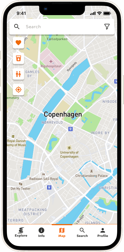
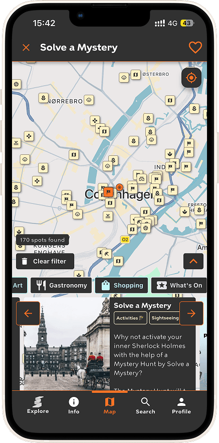
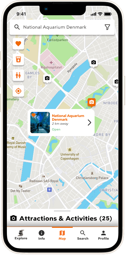
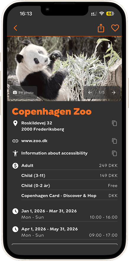
MAP SECTION
Opening Map
before
after

Filtered Locations on Map
before
after


Selecting Location on Map
before
after
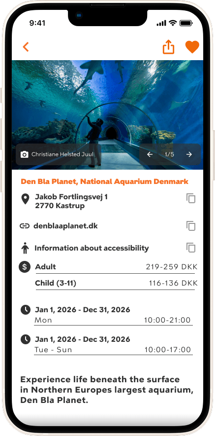
Clicking Location on Map
before
after


SEARCH SECTION
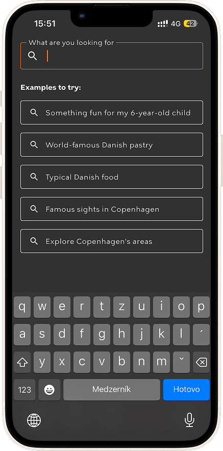
Search bar
before
after

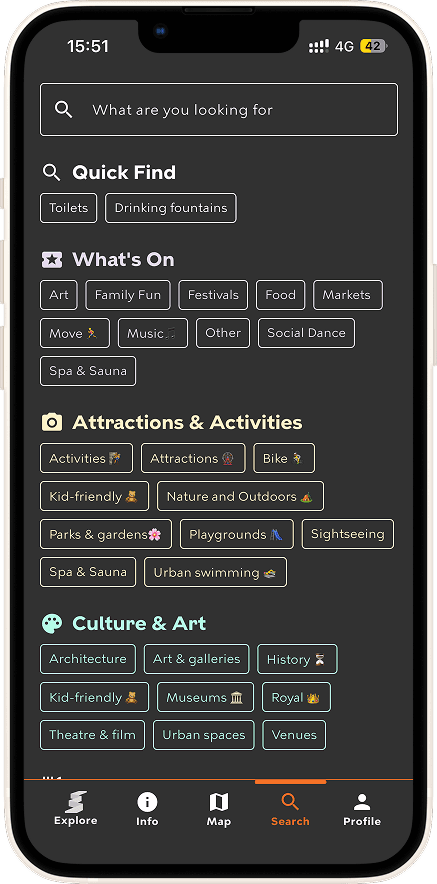
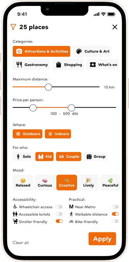
Filtering
before
after
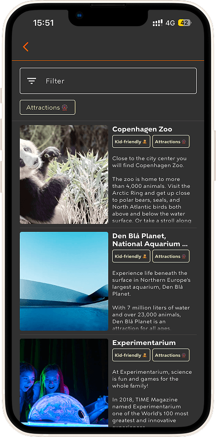
Search results (list)
before
after

Search results (swipe)
new added feature
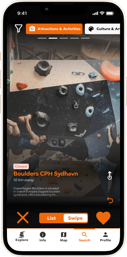

Swipe feature
clicking to see different pictures and features


PROFILE SECTION
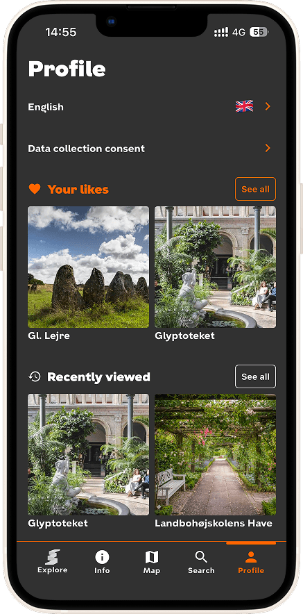
Profile (+dark/light mode)
before
after
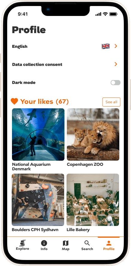
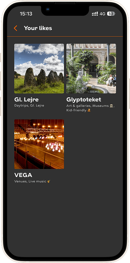
Filtering in "Your likes"
before
after


MAP SECTION
Opening Map
before
after
Filtered Locations on Map
before
after
Selecting Location on Map
before
after
Clicking Location on Map
before
after
MAP SECTION
MAP SECTION
Opening Map
Opening Map
before
before
after
after
Filtered Locations on Map
Filtered Locations on Map
before
before
after
after
Selecting Location on Map
Selecting Location on Map
before
before
after
after
Clicking Location on Map
Clicking Location on Map
before
before
after
after
SEARCH SECTION
SEARCH SECTION
SEARCH SECTION
Search bar
Search bar
Search bar
before
before
before
after
after
after
Filtering
Filtering
Filtering
before
before
before
after
after
after
Search results (list)
Search results (list)
Search results (list)
before
before
before
after
after
after
Search results (swipe)
Search results (swipe)
Search results (swipe)
new added feature
new added feature
new added feature
Swipe feature
Swipe feature
Swipe feature
clicking to see different pictures and features
clicking to see different pictures and features
clicking to see different pictures and features
PROFILE SECTION
PROFILE SECTION
PROFILE SECTION
Profile (+dark/light mode)
Profile (+dark/light mode)
Profile (+dark/light mode)
before
before
before
after
after
after
Filtering in "Your likes"
Filtering in "Your likes"
Filtering in "Your likes"
before
before
before
after
after
after